Join to earn - tab colors too dark

Where it says “Join Now” “Claim Now”, etc…I think the colors are too dark for those buttons, could do with a lighter shade for better ui/ux
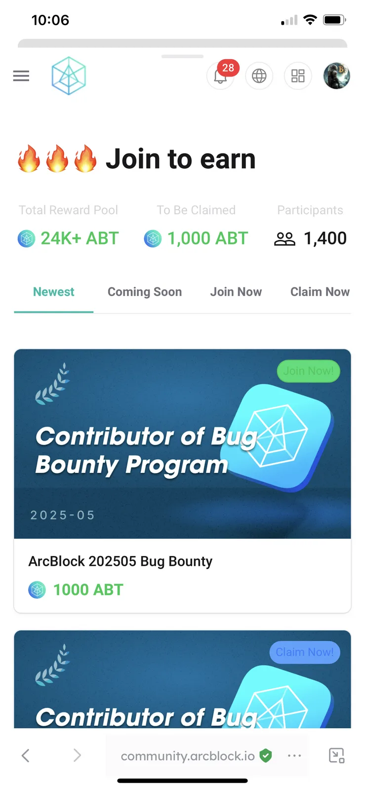
Where it says “Join Now” “Claim Now”, etc…I think the colors are too dark for those buttons, could do with a lighter shade for better ui/ux