
JSON and Custom type prop on pages kit

Hi fam, I'd like to know what are the use cases for these options on pages kit properties for components. How can I use them or what is the wat to use them?
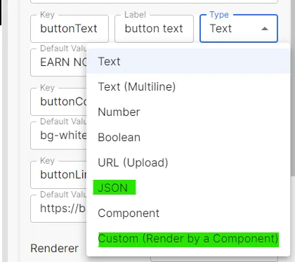
Hi fam, I'd like to know what are the use cases for these options on pages kit properties for components. How can I use them or what is the wat to use them?
4 条回复
It's a pleasure for you to use our products, let me answer your questions.
JSON :
With the JSON option, you can maintain a JSON string, which can be used to support complex data that can be used directly as an object in a component, as shown in the following example.
The page will display the following:
Custom (Render by a Component) :
This option is used for custom properties. For scenarios where a custom data source is used, you first need to create a new custom component that selects the data, and then modify the selected value in the component via the
onChangeevent:Select this component in use:
We can select data from a custom data source and then use it in our code :
We hope this answers your questions and you can give us feedback if you have any.
Could you help me? I'm building a component that has the option to select between different styles using a select-list as per example but I'm having problems getting the browser to render it in production. I noticed that for some reason it is not detected as component and the styles are not applied in staging nor in production.
Could you help me find the error? I don't know if I'm missing something. you can check production at justhodl.did.life
It looks like some of the styles aren't working. Feel free to share how you set the styles. Are you using the tailwindcss?
I found a discussion of tailwindcss that can be referenced to solve this problem.