
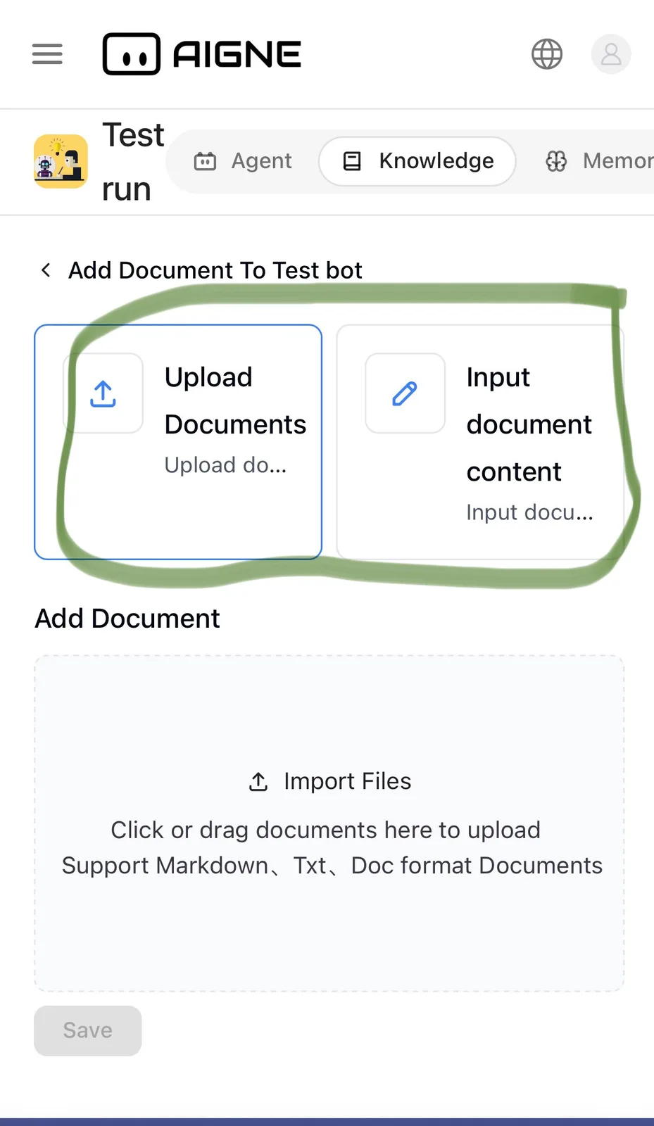
Knowledge base document upload icons.

This should be reformatted for a better UI. Possibly move text down from the blue boxes so all the text shows up. Also maybe adjust the spacing in the description of file types under import files example .Txt, .Doc etc
2 条回复
yes, if the blue box stays on top and the text goes underneath it that would make the UI look a lot cleaner🤝
fixed