Cancel Button UI Overlap During Post Creation

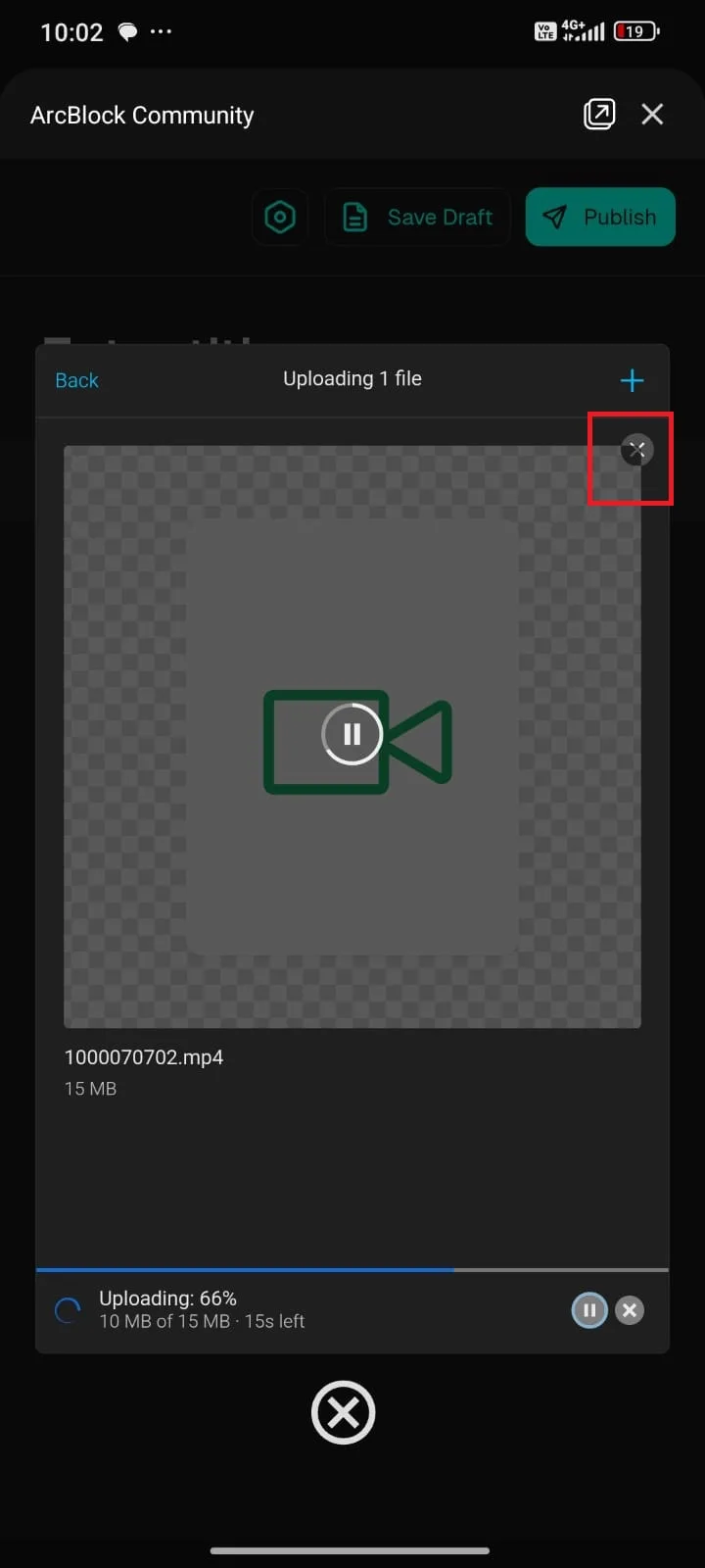
When I tried to create a post in ArcBlock Community and uploaded a file, I noticed a strange UI behavior. The cancel (X) button at the top right corner was partially overlapped by the file preview area, making it look inconsistent and less clear.
At first glance, it’s not obvious whether the button is properly clickable or part of the preview background. This creates confusion in the interface.
Expected: the cancel button should be displayed clearly above all elements (overlay), with proper spacing so it’s not visually merged with the preview.
Actual: the cancel button appears overlapped by the file preview, reducing visibility and usability.