
Comment Section Component for the Pages Kit

Yo! So I was recently able to create a comment section inside the pages kit for my videos.
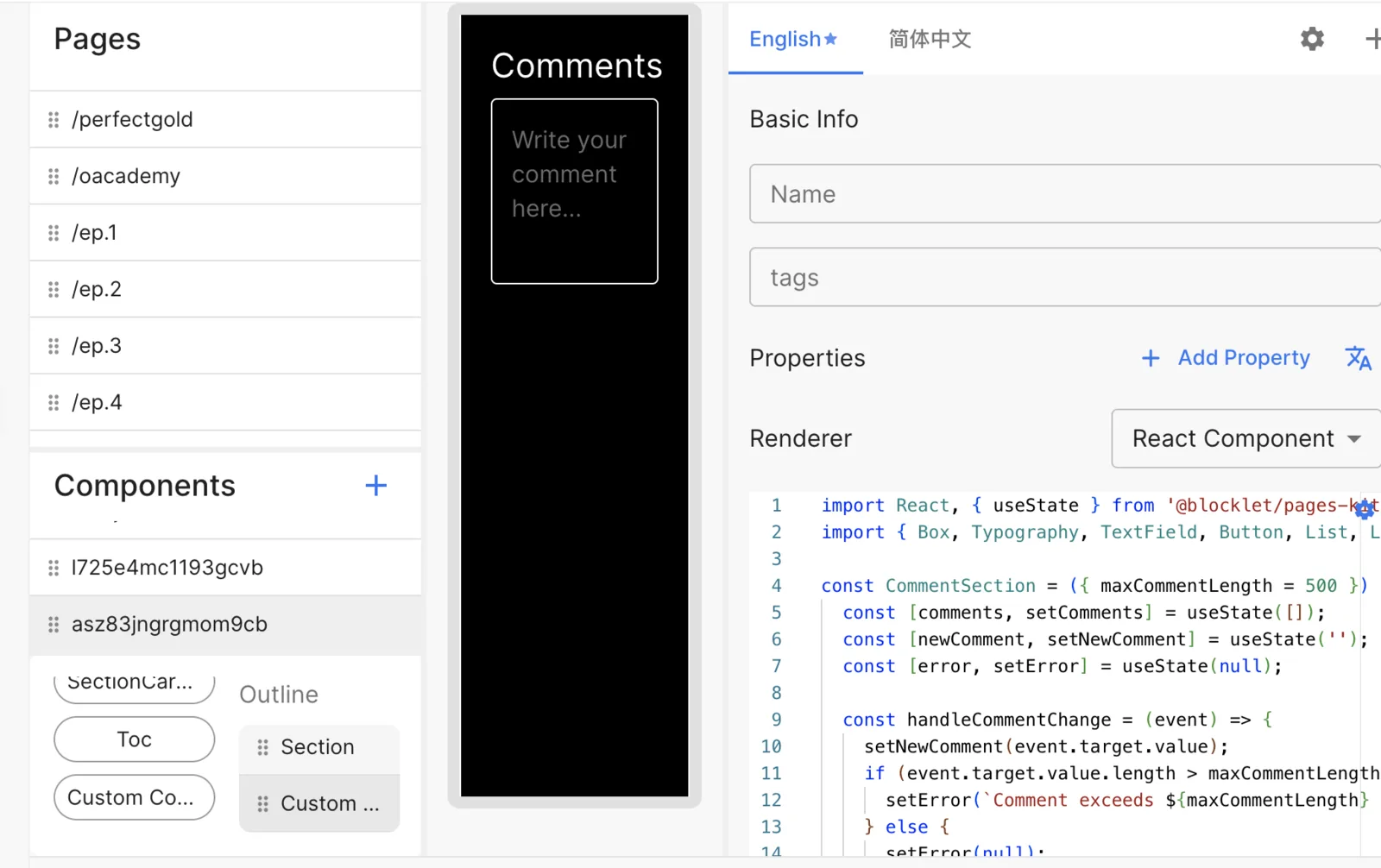
This is how it looks. It's just a front end, and once refreshed, it deletes all comments.
So it works, but it is not useful lol.
I'm curious if you could help me figure out how to connect the comment component I've made to the Pages-Kit in a way that when the user Logs in with their DID: Wallet to my app, they can leave a comment that is correlated to their DID Login, and delete it also if necessary, as it normally would be with say leaving a comment on this Discussion? Is this possible?
This is the code I used for the comment section if you need to look at it.
Feel free to suggest whatever, or tweak it if you want.
Thanks in advance!!
import React, { useState } from '@blocklet/pages-kit/builtin/react';
import { Box, Typography, TextField, Button, List, ListItem, ListItemText, Divider } from '@blocklet/pages-kit/builtin/mui/material';

const CommentSection = ({ maxCommentLength = 500 }) => {
  const [comments, setComments] = useState([]);
  const [newComment, setNewComment] = useState('');
  const [error, setError] = useState(null);

  const handleCommentChange = (event) => {
    setNewComment(event.target.value);
    if (event.target.value.length > maxCommentLength) {
      setError(`Comment exceeds ${maxCommentLength} characters limit.`);
    } else {
      setError(null);
    }
  };

  const handlePostComment = () => {
    if (newComment && newComment.length <= maxCommentLength) {
      setComments([...comments, { text: newComment, date: new Date() }]);
      setNewComment('');
      setError(null);
    }
  };

  return (
    <Box sx={{
      display: 'flex',
      flexDirection: 'column',
      justifyContent: 'flex-start',
      alignItems: 'stretch',
      minHeight: '100vh',
      backgroundColor: '#000',
      padding: '20px',
      color: '#fff',
    }}>
      <Typography variant="h4" gutterBottom sx={{ color: '#fff' }}>
        Comments
      </Typography>
      <TextField
        multiline
        rows={4}
        variant="outlined"
        placeholder="Write your comment here..."
        value={newComment}
        onChange={handleCommentChange}
        error={!!error}
        helperText={error}
        fullWidth
        sx={{
          mb: 2,
          '& .MuiOutlinedInput-root': {
            color: '#fff',
            '& fieldset': {
              borderColor: '#fff',
            },
            '&:hover fieldset': {
              borderColor: '#fff',
            },
            '&.Mui-focused fieldset': {
              borderColor: '#fff',
            },
          },
          '& .MuiFormHelperText-root': {
            color: 'error.main',
          },
        }}
      />
      <Button
        variant="contained"
        onClick={handlePostComment}
        disabled={!newComment || !!error}
        sx={{
          backgroundColor: '#fff',
          color: '#000',
          '&:hover': {
            backgroundColor: '#e0e0e0',
          },
          alignSelf: 'flex-end',
          mb: 2
        }}
      >
        Post Comment
      </Button>
      <List>
        {comments.map((comment, index) => (
          <React.Fragment key={index}>
            <ListItem alignItems="flex-start">
              <ListItemText
                primary={comment.text}
                secondary={
                  <Typography
                    sx={{ display: 'inline', color: 'rgba(255, 255, 255, 0.7)' }}
                    component="span"
                    variant="body2"
                  >
                    {comment.date.toLocaleString()}
                  </Typography>
                }
                sx={{ color: '#fff' }}
              />
            </ListItem>
            {index < comments.length - 1 && <Divider sx={{ backgroundColor: 'rgba(255, 255, 255, 0.12)' }} />}
          </React.Fragment>
        ))}
      </List>
    </Box>
  );
};

export default CommentSection;

export const PROPERTIES_SCHEMA = [
  {
    id: '1',
    key: 'maxCommentLength',
    type: 'number',
    locales: {
      en: { name: 'Max Comment Length', defaultValue: 500 },
      zh: { name: '最大评论长度', defaultValue: 500 }
    }
  }
];
2 replies
We are working on a way to embed the comment box into any Pages Kit page, will post steps for integration here once ready.
Awesome!! That’s a bet💯🔥