
Components props - dropdown list

Hey familia,
We keep building and learning over here.
Could someone explain to me how JSON type property works? z1VQRPSVDeeeQtyEjhmysY45kqz9LMnC3ot
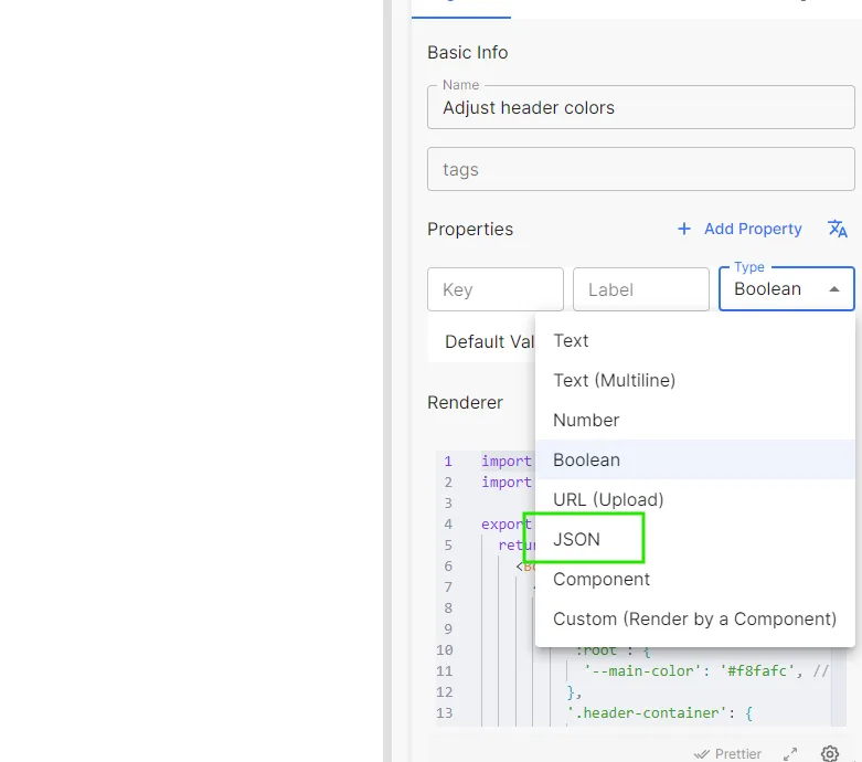
Also I'm trying to build a prop dropdown list like this, was the one below done with JSON?
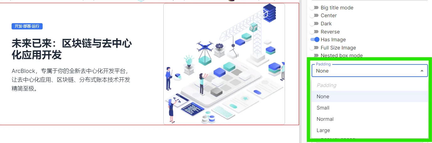
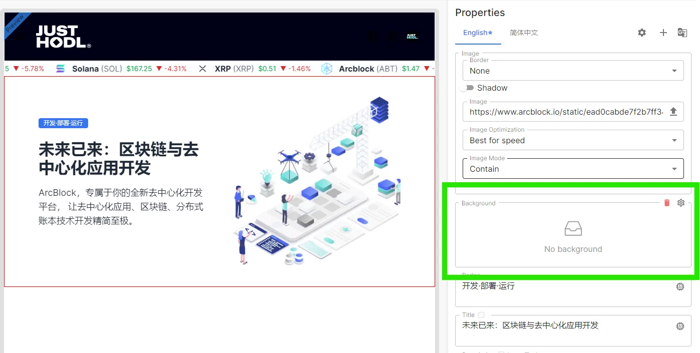
Also, How can I use this for my component?
Thanks!
6 replies
Do you want to add a Select type parameter to your component? We don't support it for now, but you can temporarily use the Text type + Helper Text to achieve it.
Yes, That's what I want. Please, let me know when you make it available. I want to create components and make them as customizable and easy to customize as possible.
If you could kindly include a example of how your workaround would look and be coded please do. I would really like to show case how far you can go with this components as a no dev.
Hey, could you give me an example on how to use text type + helper text to add a select type parameter? I would greatly appreciate it. I want to provide the best experience possible to users when using my components.
Thanks in advance
Before we support adding attributes of the Select type, you can use a simple Text type input box and prompt the user to enter one of the characters: None/Small/Normal/Large as options.
So, how could I use tool tip for this properties? since there are no placeholders on this fields because it takes default value
In your custom component properties:
When using components on the page: