Participant Avatars Overlapping on "Join & Earn" Page

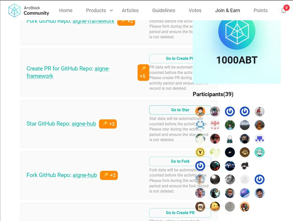
When visiting the "Join & Earn" section on the ArcBlock Community website, I noticed that the participant avatars are overlapping and not displayed in a clean or organized layout. Instead of showing in rows or a grid format, the icons appear stacked on top of each other, which makes it hard to see how many people have joined. This issue might be caused by missing layout rules (like flex or grid styling) in the CSS. It would be great if this could be adjusted so that the avatars are displayed clearly and responsively, especially as more users join the event.
4 replies
你好,我用 chrome 浏览器未能复现这个问题,请问你方便提供你的设备和浏览器的信息吗?
I'm using Google Chrome Version 138.0.7204.169 (Official Build) (64-bit) on a Windows device
你好,这个截图是来自你的手机设备?
No sir, sory typo