blocklet-launcher page

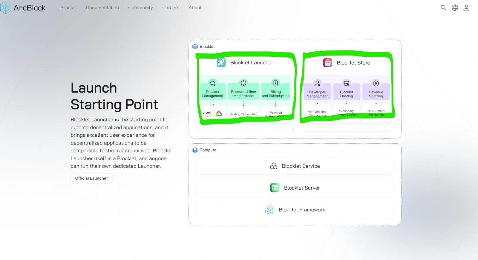
When you get into https://www.arcblock.io/content/collections/en/blocklet-launcher there are some areas that are clickable but it takes you nowhere. By clicking the ''Blocklet launcher area it should take you to the official launcher page'' same with ''blocklet store area, it should take you to the blocklet store.
UX is a bit confusing and makes hard to get into the store since the buttons to actually get you where you wanna go are too hard to see.
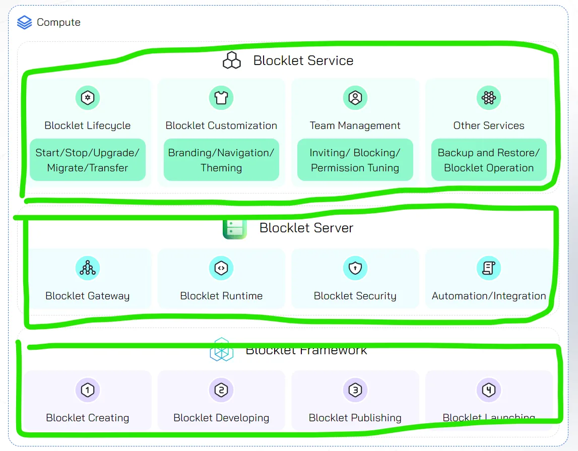
regarding this other areas of the page when you click one it expands the whole charts, but if you click again it doesn't hide it. You should be able to collapse and expand each section individually.
6 replies
If you need to jump to “Offical Launcher” you can click the button in the red box; the Offical Store has a similar button.
These areas are architectural diagrams of our products, designed to help users understand the relationship between products. After clicking on them, you can view product-related blogs below.
Scroll down the page to see these blogs.
When you click to view 'Blocklet Service / Blocklet Server / Blocklet Framework' related blogs, the area in the picture will be expanded, and when you view other product-related blogs, it will collapse.
Thanks for the feedback, I hope this answers your confusion.
Hey there!
Thanks for taking the time to write that answer. But that's my point, there shouldn't be confusions on a UX/UI design. The intuitive thing to do when something catches your attention is to hover and if it becomes clickable, is to click it expecting that it either takes you to somewhere else or you click and a new section pops.
There's a detail that I don't know if you are aware of too. When you hover the 'blocklet launcher' and 'blocklet store' sections the button to access any of those disappear and is only back visible if you click the sections.
I'm giving this feedback because it took me a lot of time and clicks to find the link to get into the launcher or store. I could jut don't make the sections clickable and change the button color to make contrast, also fix the issue of the button disappearing after you hover as in the video 🙏
Blocklets are the core of the ecosystem and people should easily get to those pages.
When you click any of the list elements of 'compute' section all the page reloads showing the whole architecture. It would be cool if by clicking it toggles the section you clicked on only. That's make the discovery process more exiting!
Thanks for all you hard work 🙏
Hey there!
Thanks for taking time to find those UX details up there. We really appreciate it! Thank you so much!
And please be patient to check the update which already working in our product grow plan.
Wish you have a nice day!
Have a good one too! Is it bounty worthy? thanks
Thank you very much for your feedback. We have optimized the UX.
Please feel free to try out the new version and let us know if you have any further feedback.
When the mouse leaves all sections, the button to jump to the official website will always be displayed.
On the ‘Blocklet Store’ page, clicking on the ‘Blocklet Store’ section will redirect you to the store homepage. Other pages offer similar features.
You rock guys! Amazing job! 💪 Will check it out and let you know