Poor Text Visibility in Dark Mode on ArcBlock Community Event Page

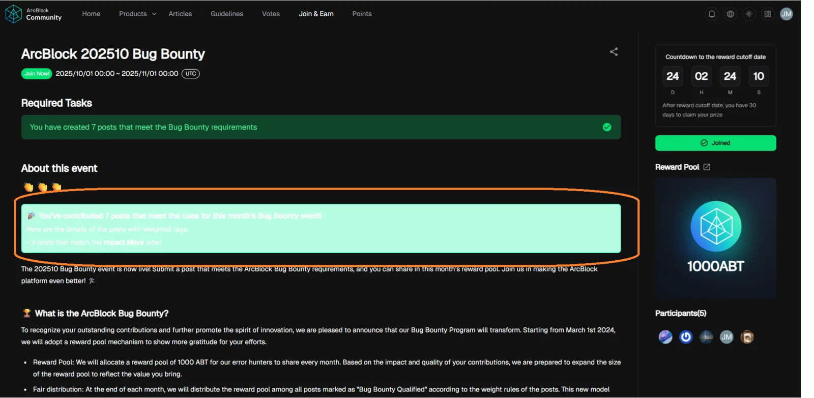
When using Dark Mode on the ArcBlock Community event page, the text under the “About this event” section becomes barely visible due to low color contrast, while it is clearly visible in Light Mode.
Environment:
- Website: ArcBlock Community
- Browser: Google Chrome (latest)
- OS: Windows 10 / Android
- Mode: Dark Mode Enabled
- Network: Stable
Steps to Reproduce:
- Visit the event page: https://community.arcblock.io/earn/activity/628802762829725696
- Switch your theme to Dark Mode.
- Scroll to the “About this event” section.
- Observe the text color and contrast.
Expected Result:
- Text under “About this event” should be clearly visible in both Dark Mode and Light Mode, maintaining sufficient contrast ratio (WCAG 2.1 standards recommend at least 4.5).
Actual Result:
- In Dark Mode, text color blends with the background, making it hard to read.
- In Light Mode, the text appears properly visible.
Impact:
- Reduces readability and accessibility for users preferring Dark Mode.
- Violates WCAG 2.1 AA color contrast accessibility guidelines.
- Poor UX especially for visually impaired users or users on OLED screens.
Weakness Mapping (CWE):
- CWE-695: Improper Control of Visual UI Elements
- CWE-183: Improper Handling of UI Colors and Contrast
Severity Classification:
- 🟠 Medium Severity
- Affects accessibility and usability but not security or core functionality.
Suggested Fixes:
- Adjust text color under “About this event” for Dark Mode to a lighter tone (#E0E0E0 or #FFFFFF).
- Maintain consistent contrast ratio ≥ 4.5 for all text elements.
- Consider using CSS variables for theme-based color control.
- Test visually under both Dark and Light themes before deployment.
⚡ Priority: Medium (Accessibility & UI issue affecting user experience).