
View Password in Dark Mode Appears Blurry and Hard to Read

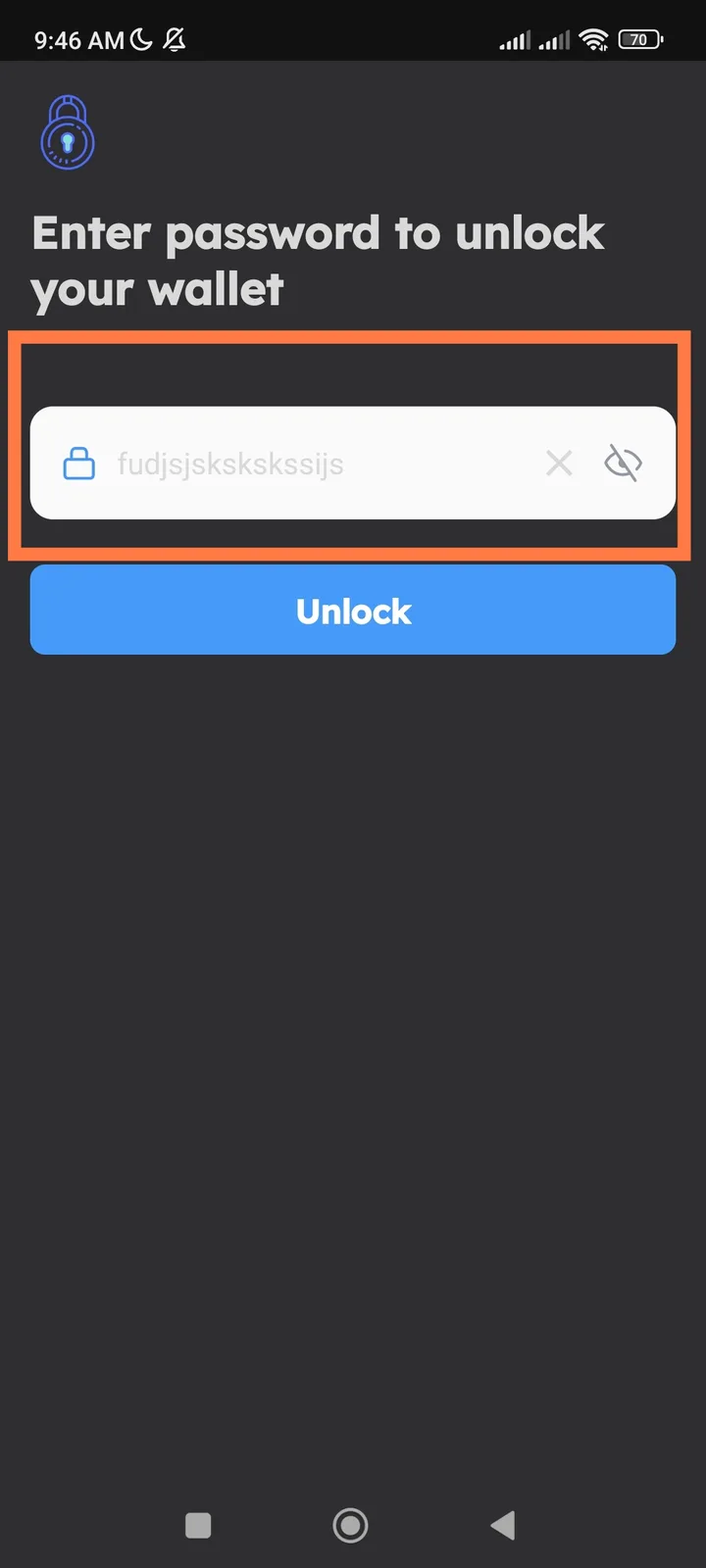
📱 App: DID Wallet 📂 Feature: View Password / Security Settings 📅 Environment: Mobile App (Dark Mode Enabled) 🔗 Related: UI / Accessibility / Dark Theme
🧾 Summary: When Dark Mode is enabled in DID Wallet, the password visibility text (after tapping “eye” icon to reveal password) appears blurry, low contrast, or faded, making it difficult to read.
🧪 Steps to Reproduce:
- Open the DID Wallet app.
- Enable Dark Mode in settings.
- Navigate to any screen requiring a password (e.g., login, security, or settings).
- Tap the “View Password” (eye icon).
💥 Actual Result:
- Password text becomes blurry or barely visible against the dark background.
- Visibility issue affects readability and user accessibility.
✅ Expected Result:
- Password text should be clear, high contrast, and readable in dark mode.
- Proper color contrast ratio should be maintained between text and background.
⚙️ Possible Cause:
- Text color or font weight not optimized for dark backgrounds.
- Missing dark mode styling for the “view password” field.
🧱 Severity: 🟠 Major (Accessibility Issue) 🎯 Priority: High 📂 Category: UI / Accessibility / Dark Mode Compatibility
💡 Suggested Fix:
- Adjust text color contrast (use white or light gray).
- Add background tint behind revealed password for better visibility.
- Ensure WCAG 2.1 contrast ratio (minimum 4.5) compliance for accessibility.
- Test readability on multiple screen brightness levels.