
Inconsistent Separator Line in Reward List UI

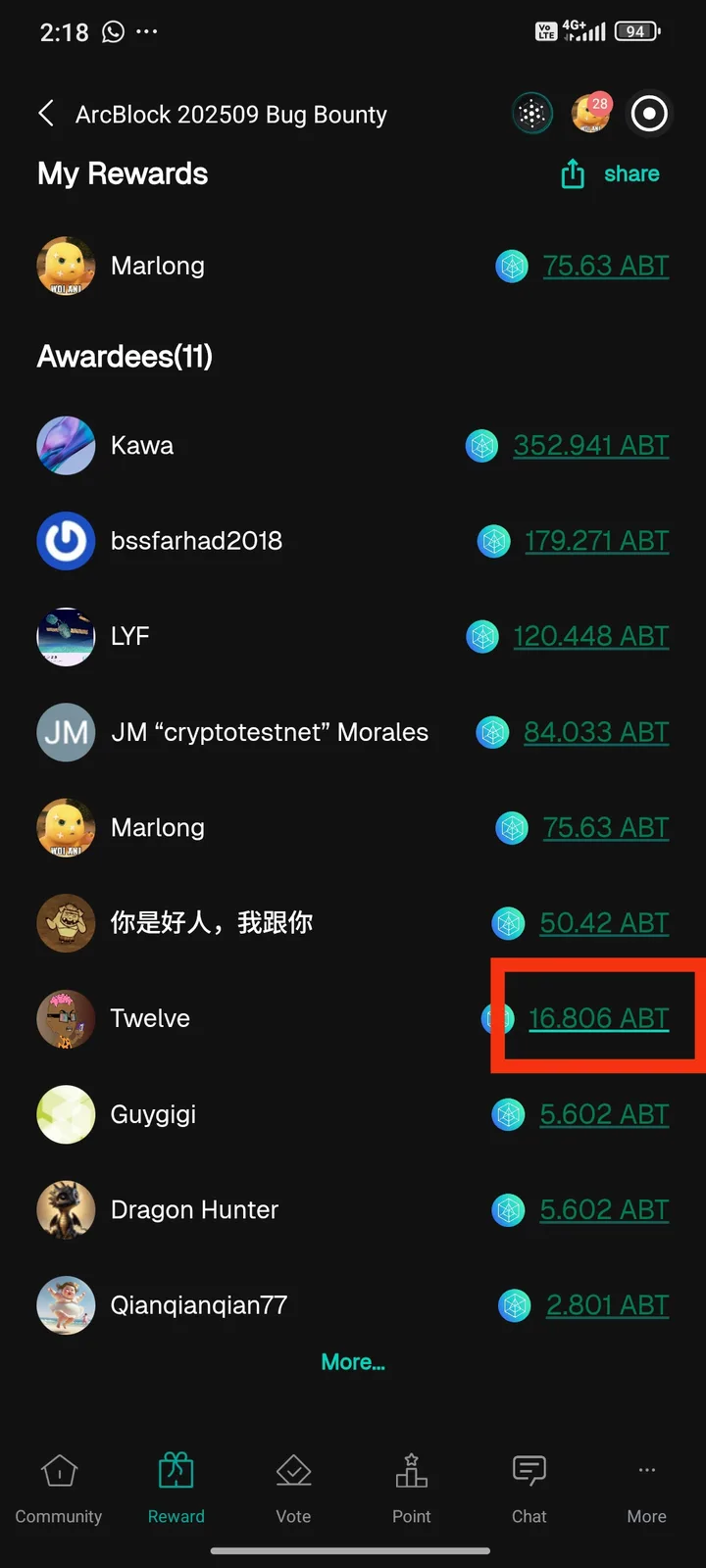
While checking the ArcBlock 202509 Bug Bounty reward list, I noticed that one of the entries (Twelve – 16.806 ABT) has a separator line that looks different from the others. The line appears darker/thicker compared to other entries, which creates inconsistency in the user interface.
Steps to Reproduce: Open the ArcBlock app. Navigate to Reward → ArcBlock 202509 Bug Bounty → Awardees list. Scroll to the entry Twelve (16.806 ABT). Observe the separator line below this entry.
Expected Result: All separator lines between awardee entries should have the same thickness and style to ensure consistency.
Actual Result: The separator line below Twelve (16.806 ABT) is visually different (darker/thicker) compared to other lines.
Impact:
Creates a UI inconsistency.
May cause confusion or reduce visual clarity for users.
1 reply
This is because you clicked (or touched) the current text, triggering its hover/focus effect.